How to unfuck CSS flex — The ABC of XYZ
UIScript DevBlog, Part 16
Intro
So far I've only talked about why the design of flex sucks so in this article I want to show you my idea of a redesign.
This might be a bit more technical, but a lot of fun if you have a little bit of experience (and patience) with this layout model.
Let's get started.
Flex is dimension agnostic
I think the biggest problem with the design of flex is that it tries to be dimension agnostic. This means that the entire configuration of a horizontal and a vertical distribution is identical (well, almost), the only difference is their main direction:
#horizontal-or-vertical {
  display: flex;
  flex-wrap: wrap;
  justify-content: flex-start;
  align-items: flex-start;
  align-content: flex-start;
}
As you can see, without the flex-direction property, we have no way of knowing what the actual horizontal and vertical layout is supposed to be, everything is abstract.
This design is only beneficial in a single scenario, where we want to transpose the distribution later on — in other words, we want to flip the axes without needing to adjust any additional properties.
This means that by changing only a single property (flex-direction), we want the previous horizontal alignment to become the new vertical alignment and the previous vertical alignment to become the new horizontal alignment, automatically.
This scenario is so weird, rare and unnatural that I can’t clearly demonstrate it.
In all other (and much simpler) scenarios, this design is extremely confusing and obscure.
A tiny detour
Aside from the fact that this dimension agnostic approach is bad, even the implementation of this idea was fumbled.
If you don’t care about UIScript and still want to keep using flex in CSS then here is a little dictionary to help you cope with all this nonsense:
- item(s): the actual child elements of a flex container
- row, column: virtual “boxes” around items
- content: either row or column, depending on the direction
Using these definitions, we can understand a little bit better what flex properties are trying to do:
- justify-content: how to fill a row or column with items
- align-items: how to position items relative to each other
- align-content: how to position rows or columns in the container
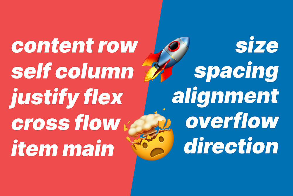
But these alignment properties are still cringe, for one specific reason: justify shouldn’t be a property name but a value (just like when working with text), but flex needs three alignment controls and items and content are already taken.
So, what about the main axis and the cross axis? Why not use those?
- align-items-main, instead of justify-content
- align-items-cross, instead of align-items
- align-content-cross, instead of align-content
We are still in dimension agnostic land, all three are alignments, all three are self-explanatory, all three are consistent and all three are using the very same concepts flex has already defined. I didn’t even have to make up anything new.
It truly eludes me why these aren’t the actual names of these properties.
A new design
Now, back to the actual redesign.
I wanted to design something that is far more generic and I also wanted to drop this dimension agnostic bullshit.
To build a better system, we need to understand three concepts. First, the concept of axes. This is the easiest, we have X, Y (and Z), we just need to use them in our model.
Second, we need to list what features we want to control using this container. A linear distribution (including flex) has five:
- size
- spacing
- alignment
- overflow
- direction
And third, we need to be able to control these features for all views, including the container and each and every content view. This is where things get a bit more complex, for two reasons:
- children can be controlled in two ways: all children together on the parent or one by one individually on themselves
- containers can be nested inside each other, so a View can be a parent and a child at the same time
Again, even though we are dealing with a simple linear distribution, we can easily end up with a complex scenario. But if you take a moment to understand these three concepts, you’ll be able to use this layout model much more efficiently.
Here is a raw but comprehensive list of all the possible properties defined by this logic:
//manipulate the child itself
child.sizeX
child.sizeY
child.spacingX
child.spacingY
child.alignX
child.alignY
child.overflowX
child.overflowY
child.directionX
child.directionY

//manipulate the parent itself
parent.sizeX
parent.sizeY
parent.spacingX
parent.spacingY
parent.alignX
parent.alignY
parent.overflowX
parent.overflowY
parent.directionX
parent.directionY

//manipulate all children from the parent
parent.childSizeX
parent.childSizeY
parent.childSpacingX
parent.childSpacingY
parent.childAlignX
parent.childAlignY
parent.childOverflowX
parent.childOverflowY
parent.childDirectionX
parent.childDirectionY
Some of these might not make sense right away, some might be confusing or misleading, but let’s break them down and see what’s what.
Size
Let’s start with something simple. Every View in our layout has to have a horizontal and vertical size. We can call this sizeX and sizeY, or simply width and height:
View()
  .width(100)  //sizeX (horizontal size)
  .height(50); //sizeY (vertical size)
This is true for the container and for all of its contents, too:
Stack(
  View().width(50)
  View().width(70)
  View().width(90)
)
  .width(300);
But the whole point of a container is to have the ability to control all contents simultaneously, right from the container. This would look something like this:
Stack(
  View(),
  View(),
  View()
)
  .width(300)
  .childWidth(100);
Unfortunately, CSS flex kind of forgot about this.
Spacing
Spacing is also fairly simple and a bit better supported in CSS flex than size.
When we control spacing directly on children, we use margin:
Stack(
  View().marginX(10),
  View().marginX(20),
  View().marginX(30)
);
and when we control spacing from the parent, we use gap:
Stack(
  View(),
  View(),
  View()
)
  .gapX(20);
Spacing is where the importance of having control directly on the parent vs having control on the children becomes clear: gaps don’t belong to any children logically, they sit between them, so it is cumbersome to handle them directly on children.
So, for example this:
Stack(
  View().marginRight(10)
  View().marginLeft(10)
);
is much better like this:
Stack(
  View(),
  View()
)
  .gapX(20);
Alignment
Alignment is a bit more nuanced, but should work the exact same way. We need a way to handle alignment horizontally, vertically and control children from the parent or directly from themselves.
To control children from the parent we could do something like this:
HStack(
  View(),
  View(),
  View()
)
  .childAlignY("center");
and to control alignment directly on children we could do something like this:
HStack(
  View().alignY("top"),
  View().alignY("middle"),
  View().alignY("bottom")
);
However, there are two differences between horizontal and vertical alignments:
- Overriding horizontal align on children in a horizontal distribution doesn’t make sense (or vertical align in a vertical distribution), because that would conflict with the entire point of a Stack/distribution.
- If the distribution is wrapping, we need an additional vertical align value in a horizontal (or an additional horizontal align value in a vertical) distribution. This value is analogous to
align-content.
So, instead of two values on the parent and two on each child, we need three values on the parent and one value on each child, like this:
HStack(
  View().alignY("top"),           //same as align-self, overrides childAlignY
  View().alignY("middle"),        //same as align-self, overrides childAlignY
  View().alignY("bottom")         //same as align-self, overrides childAlignY
)
  .childAlignX("left")            //same as justify-content
  .childAlignY("top", "middle");  //same as align-items and align-content
and this:
VStack(
  View().alignX("left"),          //same as align-self, overrides childAlignX
  View().alignX("center"),        //same as align-self, overrides childAlignX
  View().alignX("right")          //same as align-self, overrides childAlignX
)
  .childAlignX("left", "center")  //same as align-items and align-content
  .childAlignY("top");            //same as justify-content
Make no mistake, you do the exact same thing with flex, the only difference is that you need a ton of extra concepts like item, content, justify, and self.
Overflow
Overflow is a generic container feature. It handles content that is bigger than the container.
There are two important things here:
- Stacks (flex) introduce the wrap, which is an overflow strategy, not a standalone feature. Overflow strategies are mutually exclusive, meaning that if we use for example crop or scroll, the content cannot wrap anymore, because it makes no sense. Conversely, if the content wraps, it cannot be cropped or scrolled.
- Overriding the overflow strategy on children is a weird concept. Flex doesn’t support it and it doesn’t make much sense so there is no solution for this in UIScript either.
Since we don’t need this on children, we need only two properties on the parent: overflowX and overflowY:
HStack(
  View(),
  View(),
  View()
)
  .overflowX("top-bottom") //visible, crop, scroll, top-bottom (wrap), bottom-top (wrap)
  .overflowY("scroll"); //visible, crop, scroll (not possible to wrap)
However, there are some rules that we need to keep in mind:
- If the parent is bigger than its children, overflow (including wrapping) cannot happen. This includes the scenario where the parent inherits its size from its children (the parent is always the same size as the sum of its children). You can read all about Stack sizing in this article.
- If the parent is smaller than its children (overflow happens), then no alignment can happen, it just doesn’t make much sense.
- Wrapping can only be set as an overflow strategy in the direction of the distribution. A Stack (flex) cannot wrap into two dimensions or even into two directions at the same time, it doesn’t make much sense either.
- Wrapping can happen in two directions: a horizontal Stack can wrap from top to bottom or from bottom to top, a vertical Stack can wrap from left to right, or from right to left.
Direction
Direction in a Stack (flex) is similar to overflow in that it is only relevant for the parent and overriding it on children makes little to no sense.
There are two ways to think about direction in Stacks:
- either there is one direction value and one overflow value if wrap is needed,
- or there are two direction values: one for the distribution and one for wrap if needed.
These are just different mental models, they both describe the same thing:
//directionX + overflowX
Stack()
  .directionX("left right")
  .overflowX("top bottom");

//directionX + directionY
Stack()
  .direction("left right", "top bottom");
To learn more about Stack directions, you can check out this article.
Putting it all together
Remember the comprehensive list from earlier? We can now change a few names and it’ll all come together as one system:
//manipulate the child itself
View()
  .width()        //sizeX
  .height()       //sizeY
  .marginX()      //spacingX
  .marginY()      //spacingY
  .alignX()       //alignX
  .alignY();      //alignY
  //.overflowX()  //overflowX, not allowed on children
  //.overflowY()  //overflowY, not allowed on children
  //.directionX() //directionX, not allowed on children
  //.directionY() //directionY, not allowed on children

//manipulate the parent itself
Stack()
  .width()        //sizeX
  .height()       //sizeY
  .marginX()      //spacingX
  .marginY()      //spacingY
  .alignX()       //alignX
  .alignY()       //alignY
  //.overflowX()  //overflowX, not allowed on children
  //.overflowY()  //overflowY, not allowed on children
  //.directionX() //directionX, not allowed on children
  //.directionY() //directionY, not allowed on children

//manipulate all children from the parent
  .childWidth()   //childSizeX
  .childHeight()  //childSizeY
  .gapX()         //childSpacingX
  .gapY()         //childSpacingY
  .childAlignX()  //childAlignX
  .childAlignY()  //childAlignY
  .overflowX()    //childOverflowX
  .overflowY()    //childOverflowY
  .direction();   //childDirectionX and childDirectionY
As you can see, the basic features are the same on the parent and on the children, because any View might be a child, but only a container can be a parent.
This way, we can simplify and adjust our model a little bit:
View()
  .width()
  .height()
  .marginX() //marginLeft, marginRight is also available
  .marginY() //marginTop, marginBottom is also available
  .alignX()
  .alignY();

Container() //same as View, plus these
  .childWidth()
  .childHeight()
  .gapX()
  .gapY()
  .childAlignX()
  .childAlignY()
  .overflowX()
  .overflowY()

Stack() //same as Container, plus this
  .direction();
Note: There are two more features that we need to mention:
paddingandorder. Padding is the spacing between the parent and its children so it would be wise to only work with it on containers, while order should be defined by the actual order of Views inside the parent. If we want a different order, we can simply change it, I wouldn’t want to introduce a property for this neither on the parent, nor on the children. But I will experiment with this in the future.
Conclusion
A dimension agnostic approach has very limited upside and only in rare and specific cases, but severe downsides in simpler and far more common cases.
For this, I suggest to use proper axes (X and Y) instead to define various features of containers, including distributions.
There are five such features:
- size
- spacing
- alignment
- overflow
- direction
There are two ways to control these features on a View: directly on themselves or centrally on their parent/container.
Since any View can act as a child but only a container can act as a parent, all Views should have the same set of controls to define themselves and/or override the settings coming from their parent.
The most confusing aspect we need to pay special attention to, is when a container is also a content and it controls its own features as well as its children:
HStack(
  VStack(
    View(),
    View(),
    View()
  )
    .alignY("center") //sets its own alignment (overrides its parent)
    .childAlignY("center") //sets the alignment of its children
);
Outro
Thank you for reading this article, I hope you found it interesting and useful. If so, please consider clapping, commenting and sharing my work with others.
Thanks, and take care.


